Little 5 Points Center for Arts and Community
Project information
- Category: Web design
- Client: The Little 5 Points Center for Arts and Community
- Project date: April, 2021
- Project URL: little5.wpengine.com
- Conducted as part of Georgia Tech UX/UI BootCamp
Introduction
The Little 5 Points Center for Arts and Community (L5PCAC), located in the Little Five Points district of Atlanta, houses smaller, local non-profits within the closed down Moreland Elementary School. They give these organizations the ability to thrive, and many stay within the building long-term. L5PCAC’s website needs to have a clearer picture of what they offer clients, and undergo a brand re-fresh that better reflects the vibrant Little Five Points area.
Over the course of three weeks, my classmates Sydney Hembree, Micah Stokes and I worked with L5PCAC to re-design their website.
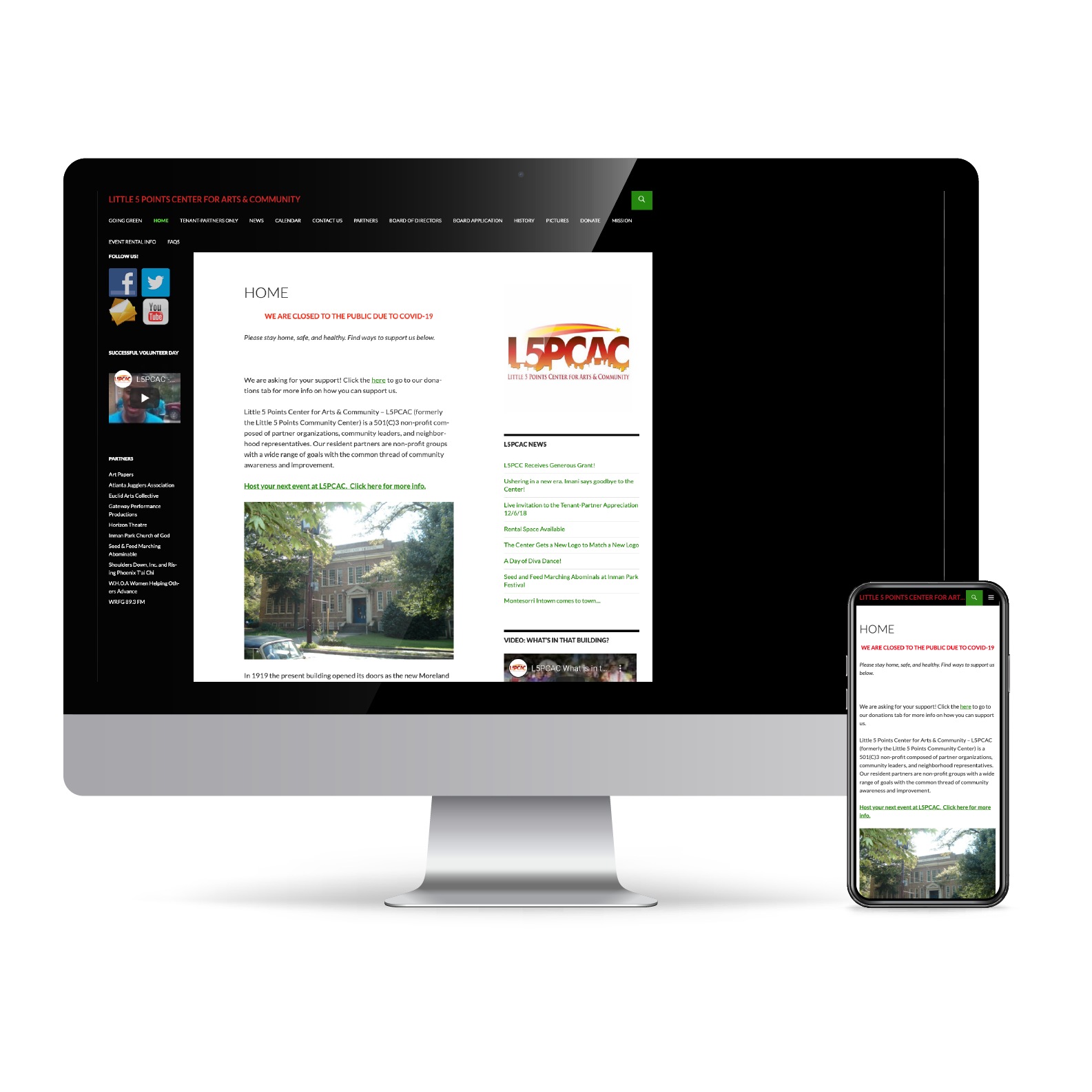
The original website, needless to say, was rough around the edges. Sydney had the pleasure of speaking with one of the employees of The Center, and apparently they have lost access to their WordPress account so most information is outdated.
Our first impressions of the current site were that we had a lot of work to do, to say the least. The color scheme and layout was visually appealing, the logo needed an update, everything on the site was left-justified, the navigation was over-crowded, information was outdated or incorrect, and private information - such as personal meetings and maintenance request forms - is available to the public.
A main source of revenue for The Center is their available rental space, but the Event Rental Info page was lacking details and photos of the spaces available.
Research
Proto-Persona
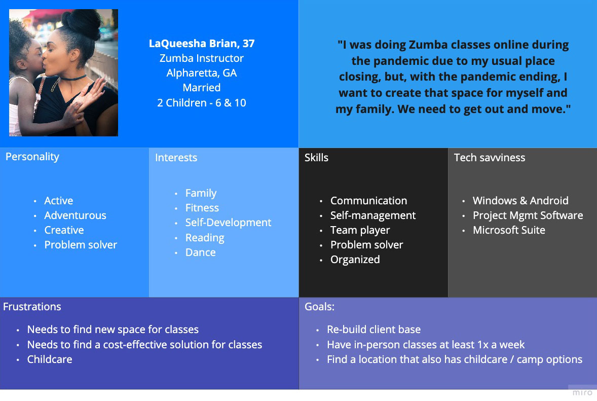
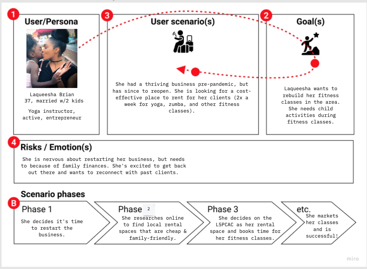
We began our research phase by developing a proto-persona. We imagined LaQueesha Brian, a middle-age fitness instructor with a young family. She worked at a gym teaching classes until the pandemic hit and, because the gym closed down, she is now looking for a reasonably priced space to host her own workout sessions. She wants a place with youth activities, a sound system, and tables and chairs for her clients to relax between classes.
Storyboard
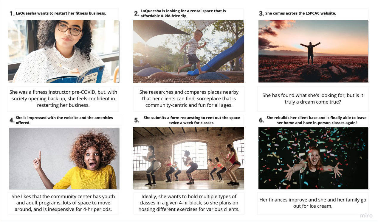
We imagined that LaQueesha is looking for a rental space that is affordable and kid-friendly to restart her fitness business. She researches potential places nearby, and comes across the L5PCAC website. She is impressed with the website and the amenities offered, and the very reasonable pricing. LaQueesha submits a rental request form, sets up class time with The Center, and successfully rebuilds her business!
User & Market Research
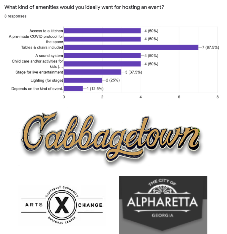
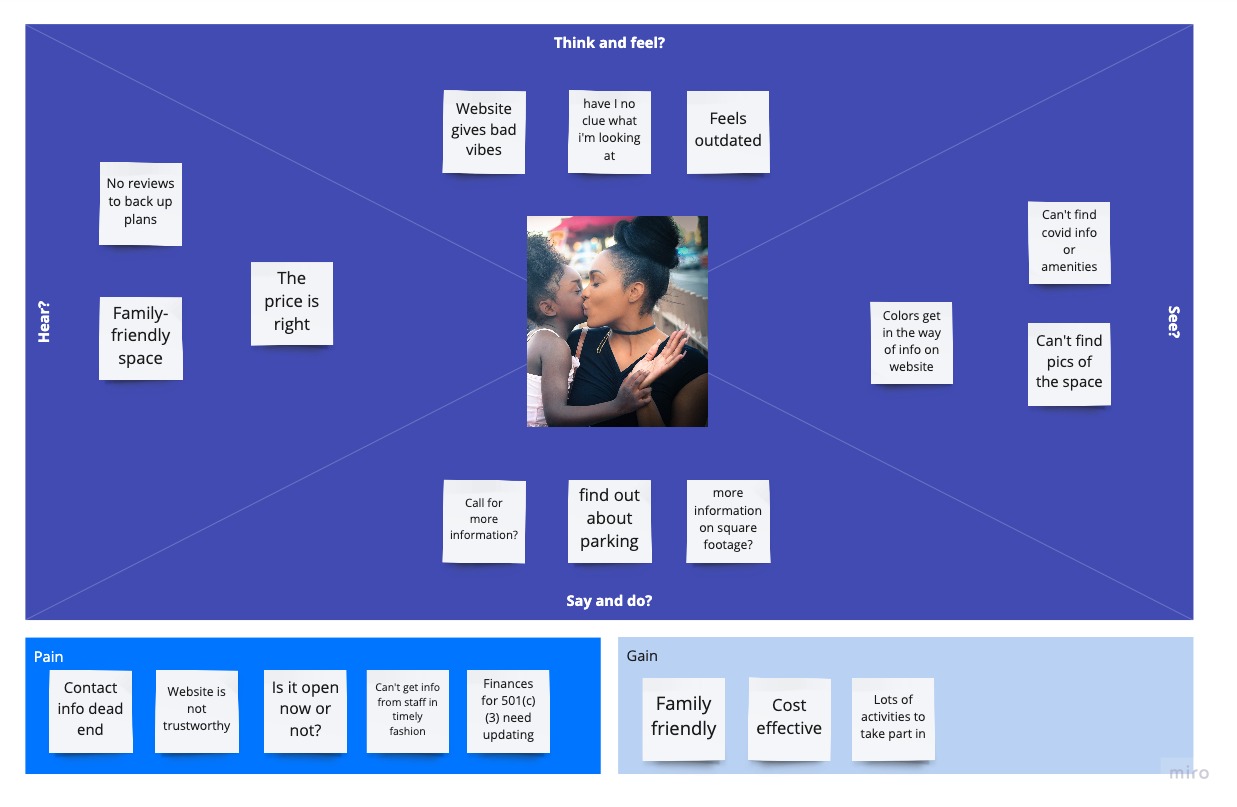
To start off our user research, we sent out a Google Form with questions asking what people look for in community centers and how they find out information about them when booking events. We discovered users want places with amenities, such as lighting, sound systems, childcare, and, in this day and age, a ready-made protocol for COVID. With this information in tow, we conducted 1:1 interviews, both with potential users and with The Center itself.
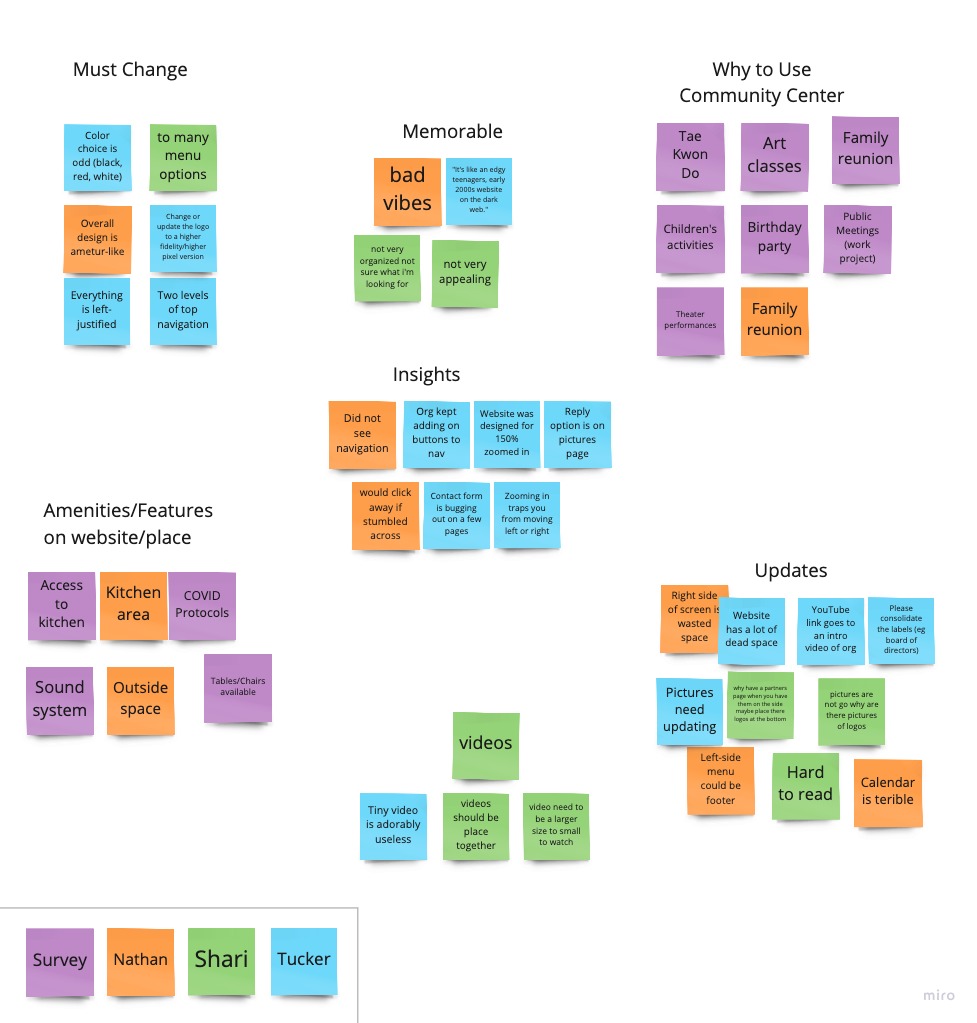
We conducted some user testing of the current website to get a sense of the usability problems. Users found the website to be difficult to navigate and find information. One user mentioned how the website was, “like an edgy teenagers, early 2000s, website on the dark web.”
We also conducted a competitor analysis, which largely consisted of other community centers near Atalanta. Competitor websites were much easier to navigate and had clear information about their offerings. Additionally, we spent some time researching the Little Five Points districts, itself, to get a better understanding of its people, aesthetic, and history.
Analysis & Definition
User Analysis
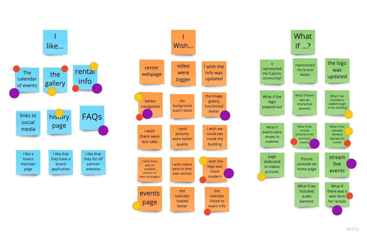
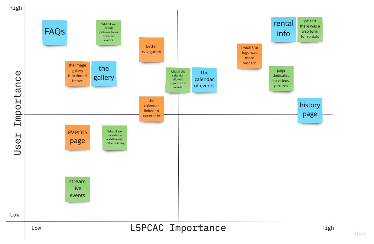
Next we analyzed our research by creating an Empathy Map, User Scenario, Affinity Map, conducting an “I like, I wish, what if” exercise, and creating a Feature Prioritization Matrix.
Some of our key takeaways were:
- Calendar needed to be greatly improved to increase awareness of their events and programs
- Rental space The Center has is very important for bringing revenue
- Logo needs a re-design
- Partners are VERY important to the organization, and need to be better highlighted
- Partners need their own space on the website to access specific resources, that is behind a login wall
Defining the Problem
We analyzed our research, and concluded that the community center’s website needs a clearer picture of what they have to offer clients.
We needed to organize their navigation, update their branding to better reflect the community they serve, and simplify the graphics and interactive elements so that users are more likely to use the community center, have return visits to the site, make financial donations, and rent the spaces available.
User Insight
During user interviews and surveys, we discovered that, when looking for a space to rent, users wanted more amenities, parking, and activities to engage children during the event in question.
Therefore, we believe that the community center’s website needs a clearer picture of what they have to offer clients and we might be able to help by organizing their navigation, updating their brand to reflect an updated change, and simplifying the graphics and interactive elements.
We might do this by discussing and reflecting client-based needs with stakeholders, researching local competition for insight, and incorporating long-term business goals into the design to reflect KPIs. Doing this will allow our product to stand out against the competition and improve rental revenue.
Value Proposition
Contributing to the stability of the in-town arts community and to the growth of community cultural organizations
Problem Statement
Little 5 Points Center for Arts & Community (L5PCAC)’s website was designed to provide information about the community, rental services within their facilities, and tenant partnerships. We have observed that our product is not representing itself, the community, nor its mission, which is causing users to overlook its services. How might we improve the L5PCAC web presence so that users are more likely to use the community center based on return visits to the site, increased donations, and increased financial gains through property rentals?
Prototyping & User Testing
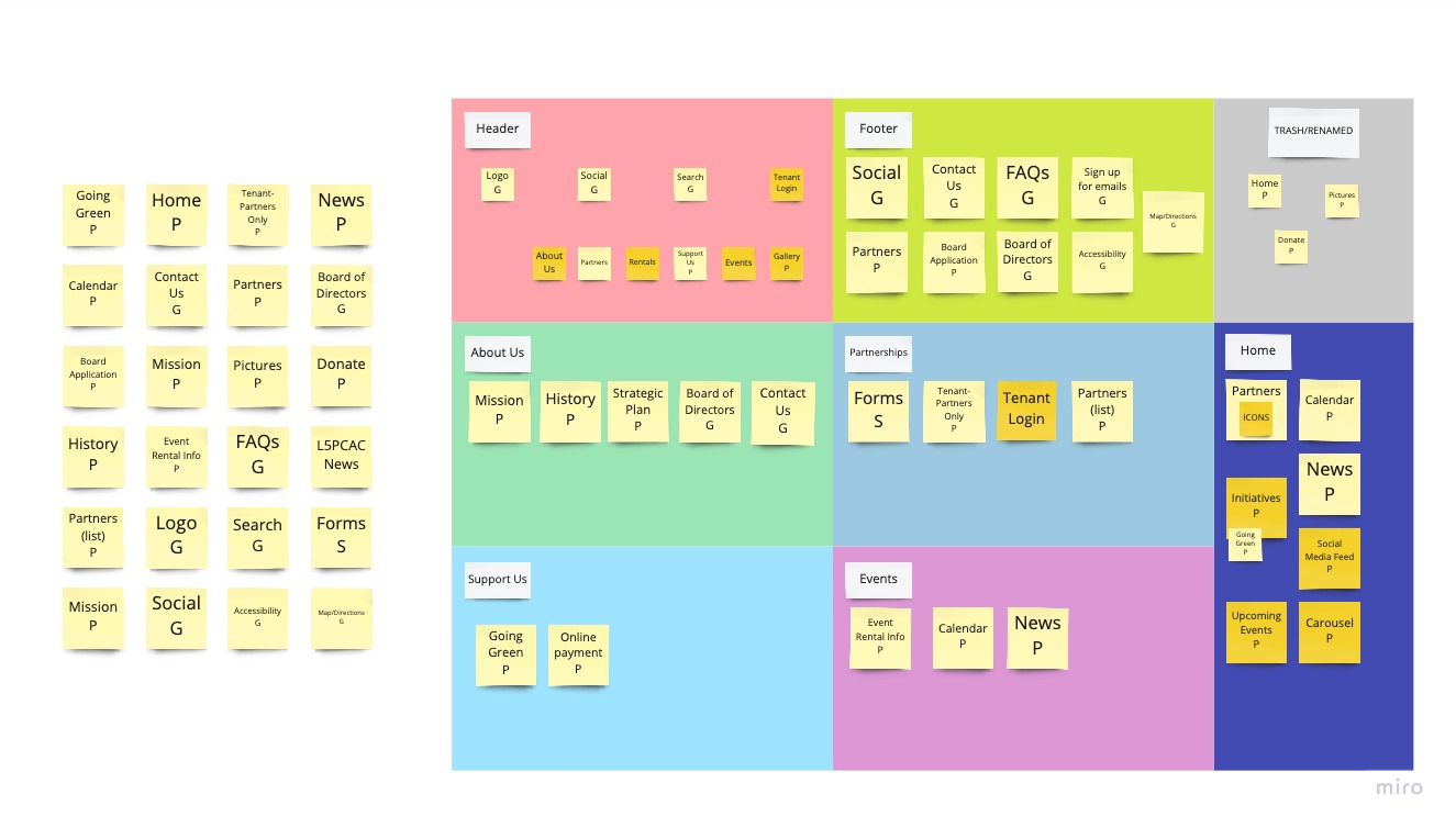
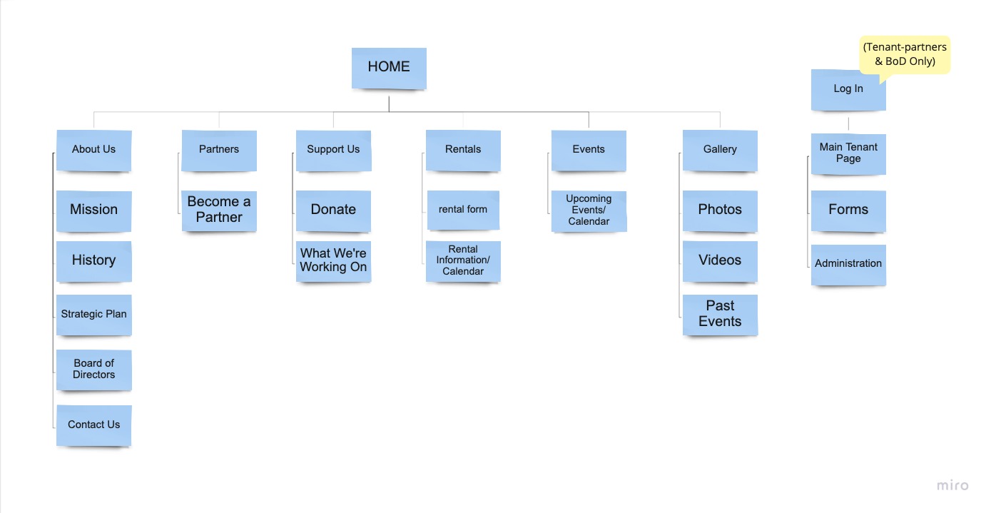
Card Sorting, User Flow, Site Map
From there, we began the process of card sorting, establishing a user flow, and creating a site map.
We consolidated the website navigation into fewer sub-pages, created a back-end for Partners, and updated some of the navigation titles. For example “Support Us” sounds less demanding/needy than “Donate.” They already had an explanation of how your donation will be supporting The Center, and updating the navigation language emphasized that.
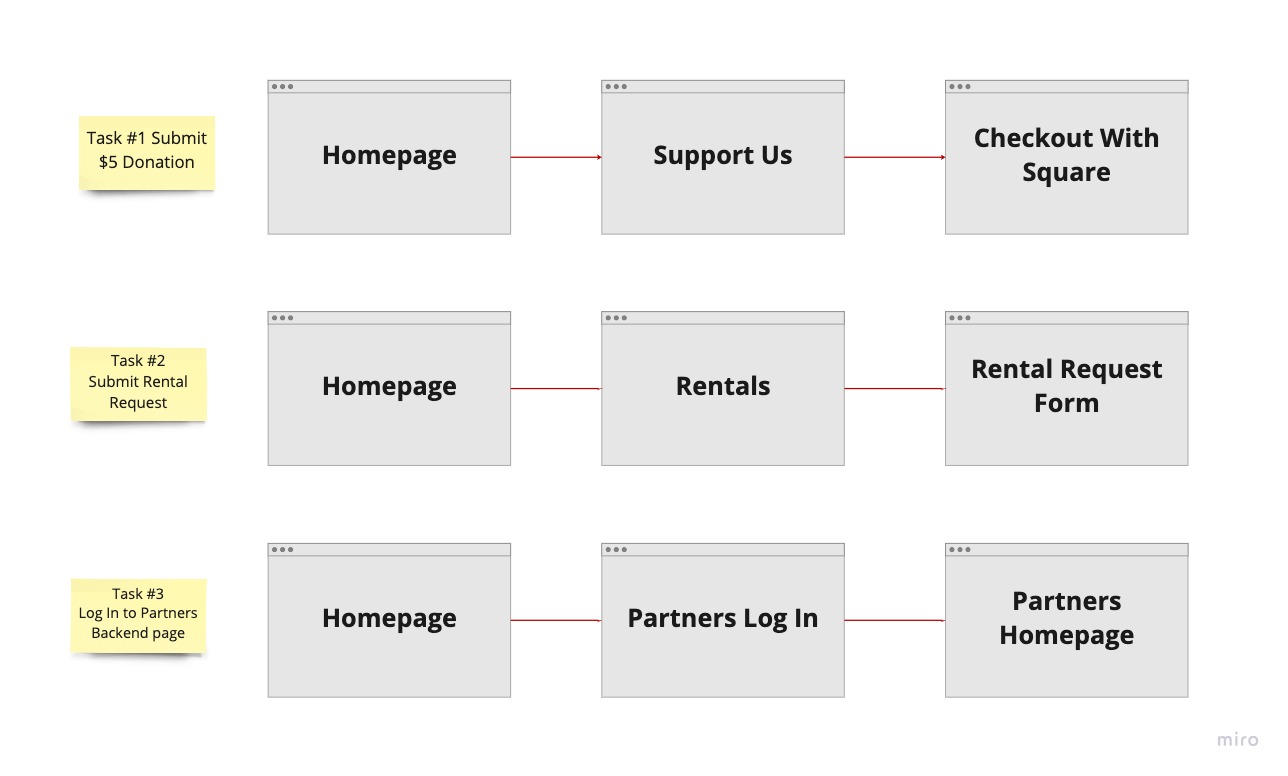
The main user flows we established to focus on were (1) making a donation, (2) submitting a rental request, and (3) logging into the Partners Homepage.
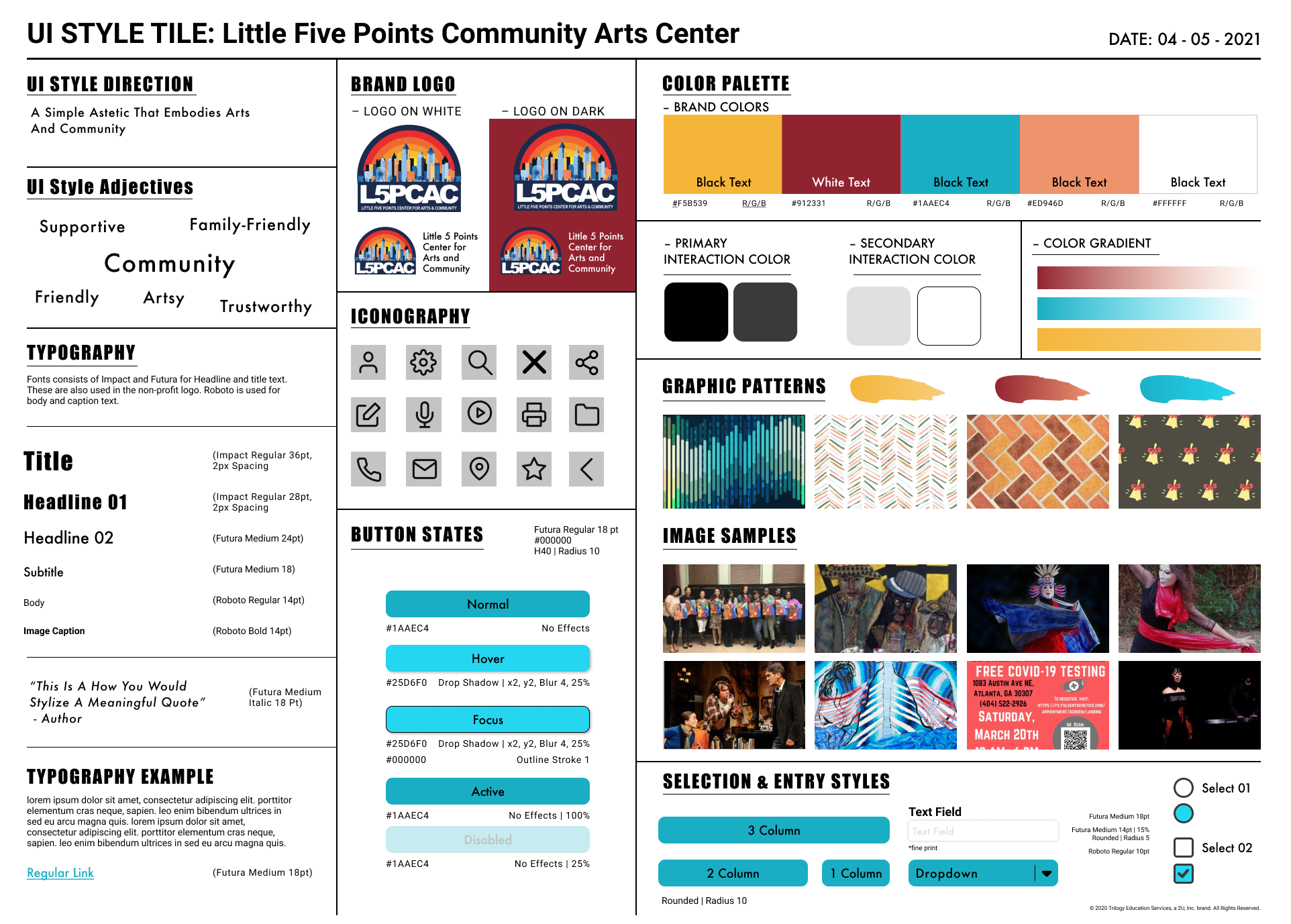
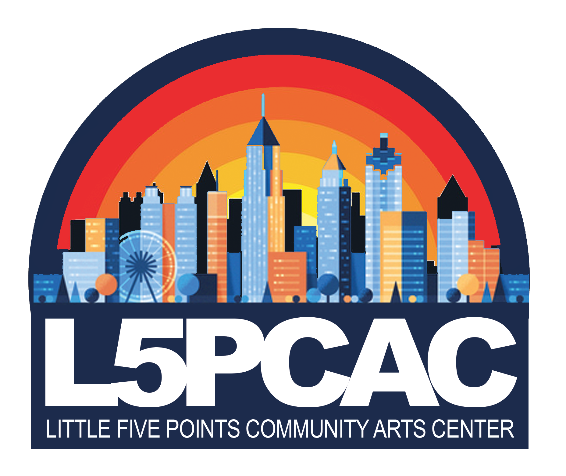
Style Tile & Logo Re-Design
When developing our Style Tile, our color palate was largely inspired by the murals that can be seen around the Little Five Points area. We were also asked to maintain the colors in their existing logo. We ended up with a Split Complementary color palate of a yellow/gold, burgundy, peach, and teal. Our intention was for the aesthetic to reflect both the graffiti art in the area, and the art programs the Center houses. For example, the navigation hover feature is a paint stroke.
Little Five Points gets its name from the literal FIVE points that intersect at the center of the district. We paid tribute to that through the use of 5 images in our carousels, and the 5-pointed star icon (which is also carried over from their previous logo).
While we all brainstormed and collaborated on the new logo design, my teammate, Micah, ultimately created the final product. The new logo features the new color palette, the Atlanta skyline carried over from the previous logo, and the L5PCAC name.
Before
After
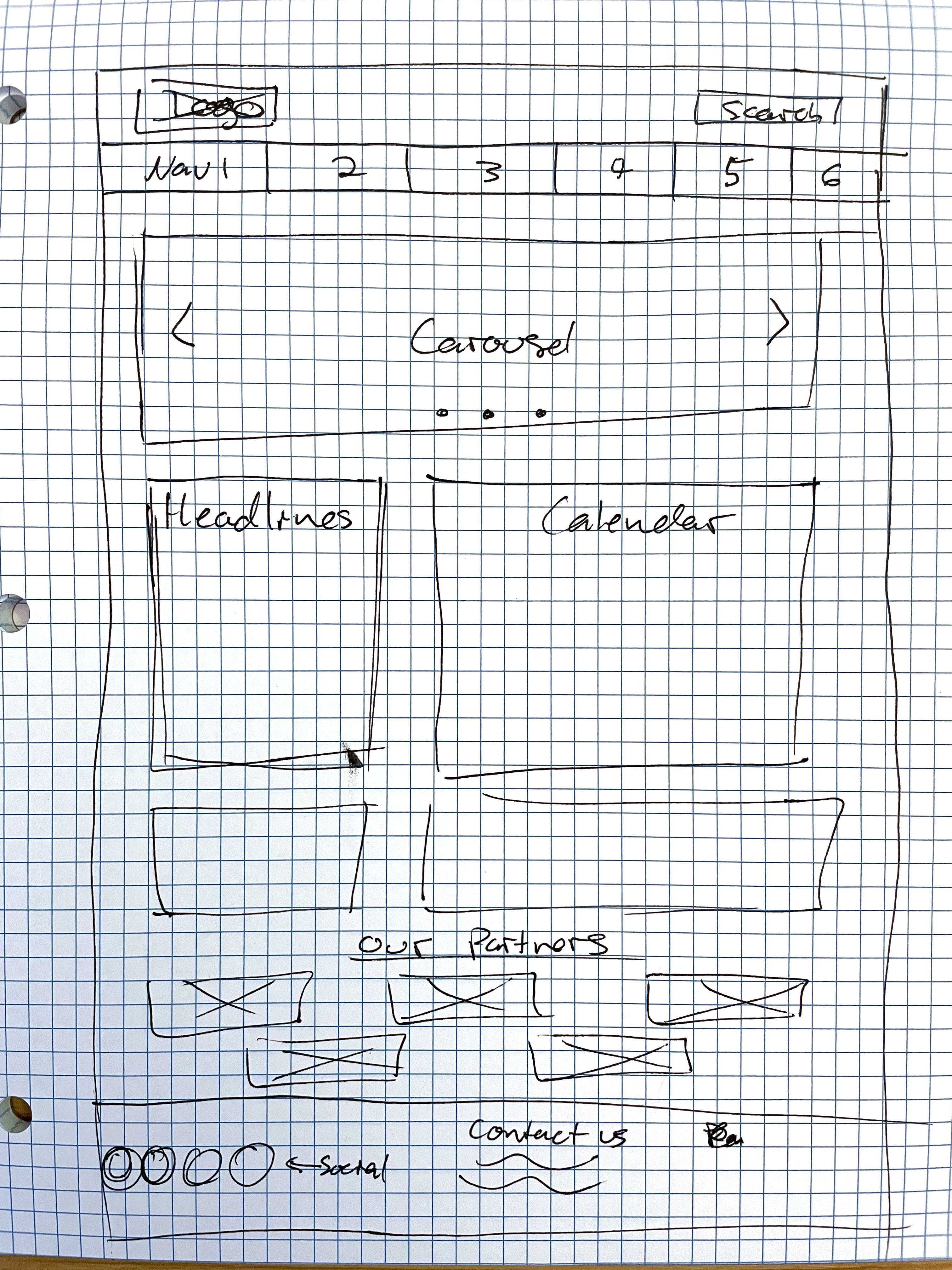
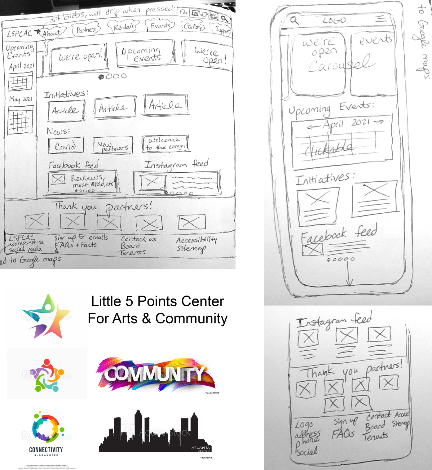
Sketches
We each did our own sketches to explore how the homepage should be laid out, as well as our initial ideas for the logo re-design.
Wireframes
Once we agreed on the general layout, we worked simultaneously in InVision to create wireframes for both the desktop and mobile versions of the site. Collaboration and teamwork was key in this stage as we needed to quickly move to user testing to stay on schedule. We did our best to divide and conquer, while still collaborating on layout design.
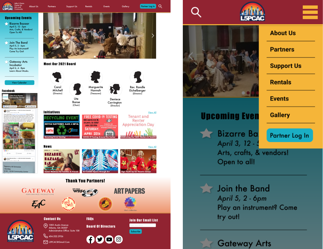
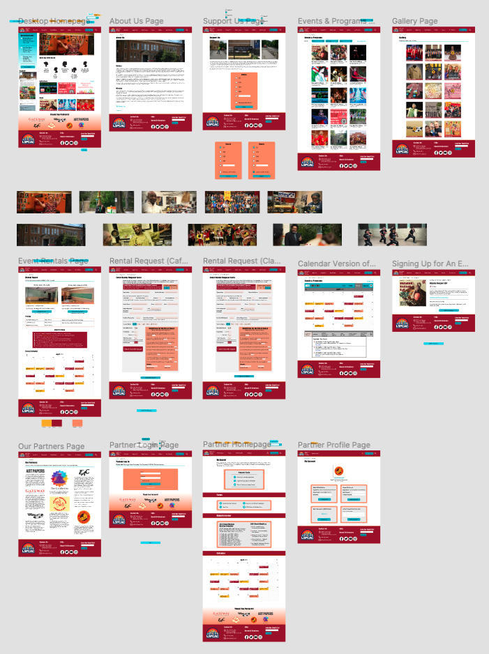
Desktop
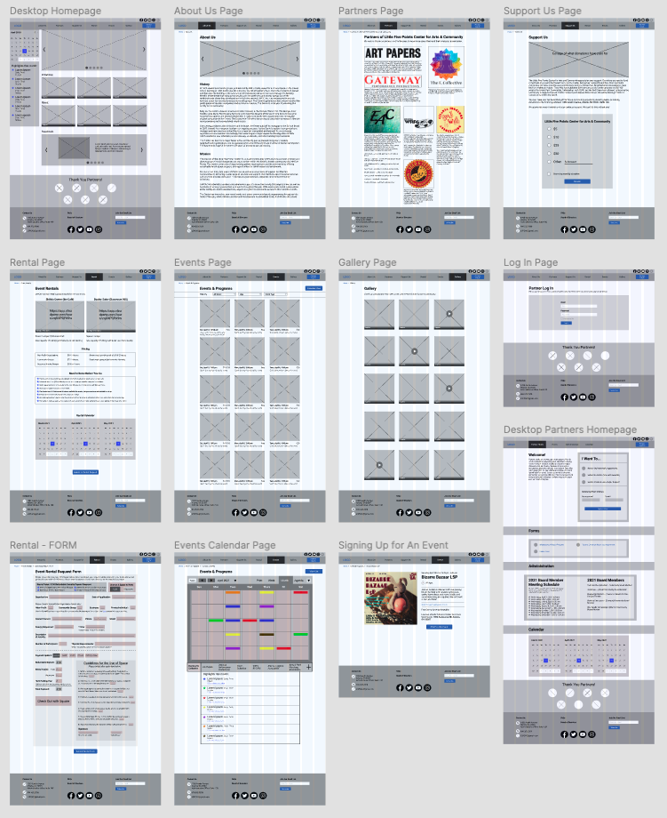
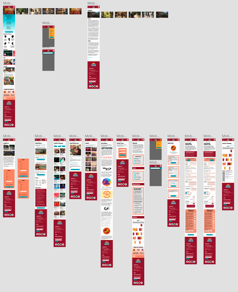
Mobile
Prototypes and Testing
Before moving onto our high-fidelity version, we tested a few users with our low-fidelity wireframe prototype to see if there's anything we should change as we move forward. Our users liked walled off section of the website for partners only, all of the details on the "Support Us" page, and overall how "straightforward and to the point" that the site was. The main criticism we recieved was to simplify the calendar and rename it as "Upcoming Events."
When prototyping our high-fidelity prototype, again, we divided efforts to ensure we remained on schedule. We set up a library of elements based on our UI Style Tile to ensure our design was consistent across pages.
We then conducted user testing of our high-fidelity prototype. Some of our users were confused by the wording of navigation pages, so we conducted additional A/B testing to see if we should change some of them. We changed "Partners" to "Our Partners" and moved it next to the "Partner Log In," and "Rentals" to "Event Rentals." Our testing showed us that users were more successful in navigating the altered "B" version.
A/B Testing

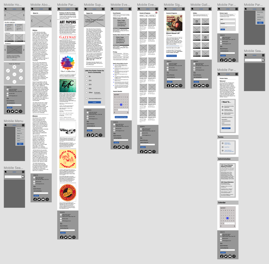
High-Fidelity
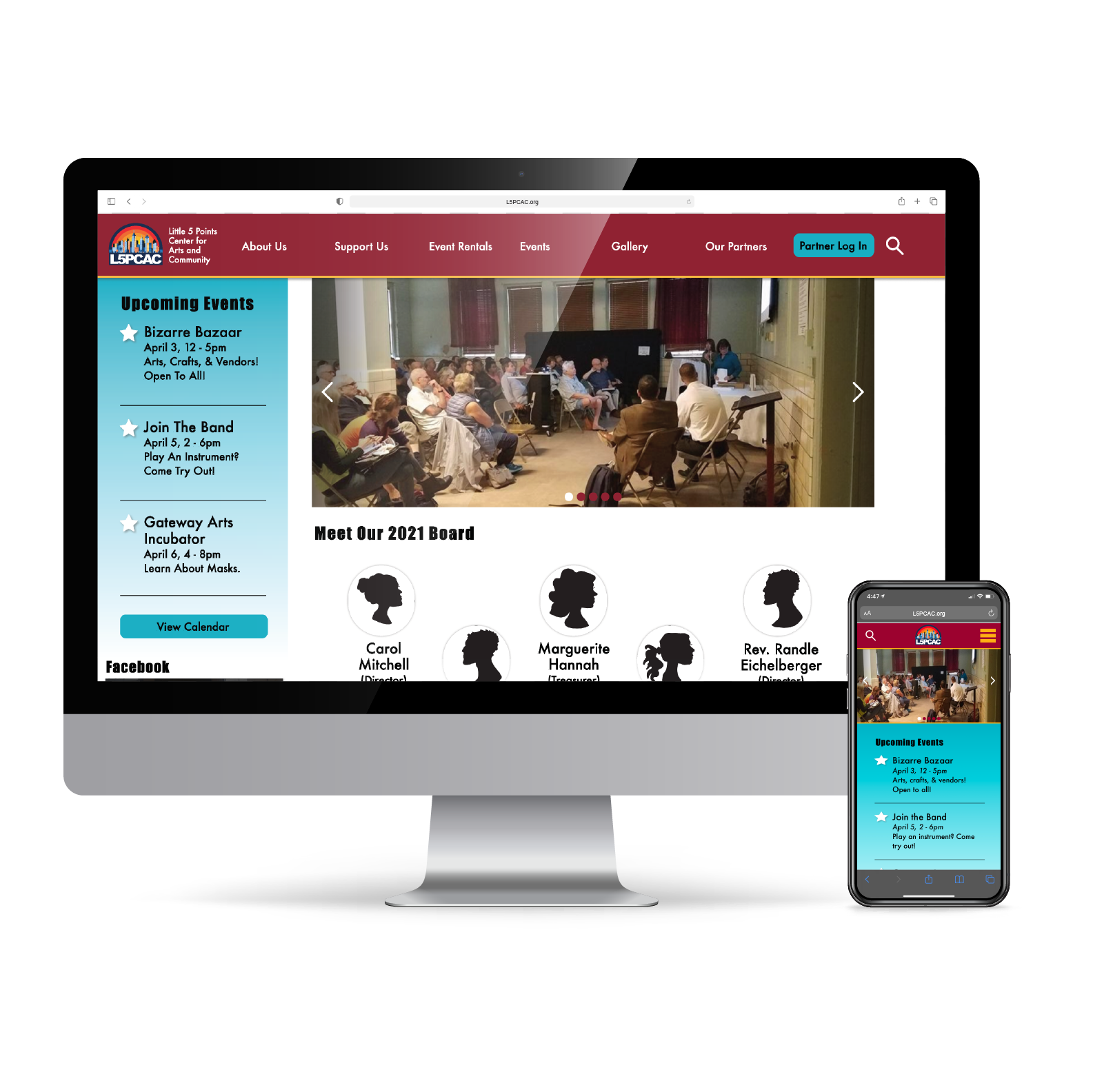
Desktop
Mobile
Final Prototype
Below are recorded click-throughs of the desktop and mobile final prototypes! Be sure to view at full screen to see all the details, or if you prefer to click through yourself please see the links at the bottom of this page.
Next Steps
Little 5 Points Center for Arts and Community loved our re-design and we are happy to report that they will be implementing our improvements. At the time, we did not have the skills to build the website for them, however, we put them in touch with a developer who was excited to assist in making the new website! While the developer created the actual site, we kept lines of communication open for any additional questions they had and any needed design adjustments.