Federal Communications Commission
Project information
- Category: Web design
- Client: The Federal Communication Commission (Hypothetical)
- Project date: March, 2021
- Conducted as part of Georgia Tech UX/UI BootCamp
Introduction
This five week sprint project was part group work and part individual work. In this hypothetical scenario, we were to imagine that we've been hired as a UI designer for a government agency that wants to redesign and update their website. We were given five weeks to research and define in our small groups, then ideate, prototype, and test individually to create a responsive website solution.
We were given a list of ten government agencies to choose from; our choices forming our groups. I felt that the FCC website really needed some TLC. I worked wtih Karen Kosasi and Will Woodward for research and definition. We researched the UI pain points that users experienced while interacting with the website, and synthesized the research into meaningful data to use to redesign the responsive UI individually.
Research
About the FCC
I started my journey by researching what all the Federal Communication Commission actually does. I was able to find most of the information I was looking for on their "About the FCC" page which happens to be the very first thing on their navigation.
The FCC's Mission
"The Federal Communications Commission regulates interstate and international communications by radio, television, wire, satellite, and cable in all 50 states, the District of Columbia and U.S. territories. An independent U.S. government agency overseen by Congress, the Commission is the federal agency responsible for implementing and enforcing America’s communications law and regulations."
FCC.gov/about/overview
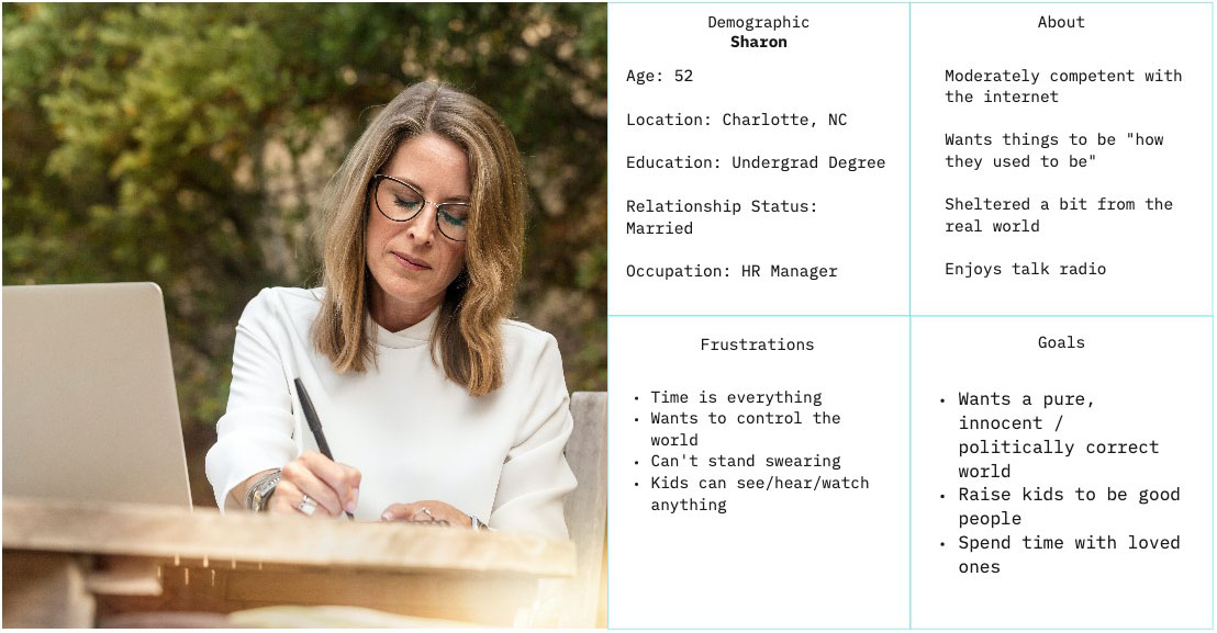
Proto-Persona
Once we had a better idea what the average person would visit the FCC website for, we created a proto-persona. From what we gathered, the average Joe - who is unaffiliated with the FCC or a media network - would visit the FCC website to file a complaint of some kind.
Our proto-persona, Sharon, very much enjoys listening to her local radio station but believes that the new talk show is violating FCC rules by being overtly vulgar and goes to the site to file a formal complaint.
User Flow Analysis & User Testing
After establishing our proto-persona, we analyzed the typical path this persona would take on the site. As a group, we conducted five total usability tests on a mix of desktop and mobile platforms. We specified two specific tasks for testing:
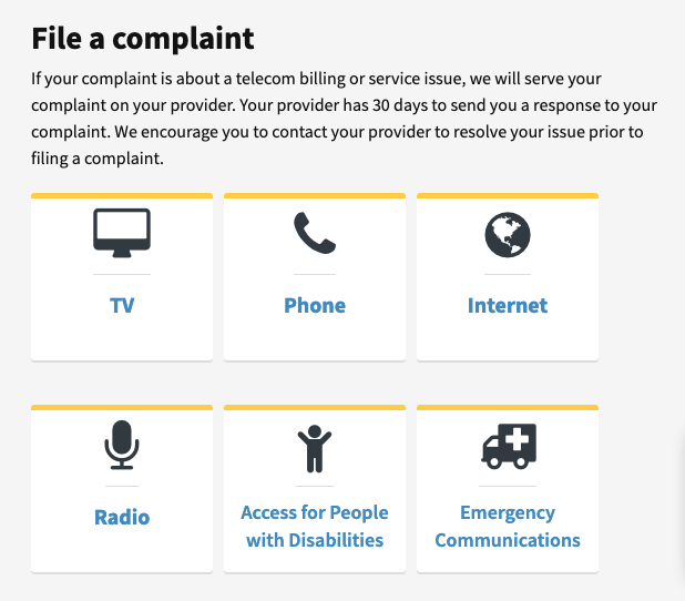
1. File A Complaint
The average user is likely to use the FCC website to file a formal complaint about a telecom billing or service issue. For the purposes of user testing, we specified a complaint about robocallers.
Assumptions: The user knows that the FCC website is used for this purpose. The user does not actually need to submit a complaint.
- Start at FCC Homepage
- Select "File a Consumer Complaint"
- Select Complaint Category (Phone)
- Fill & Submit Form
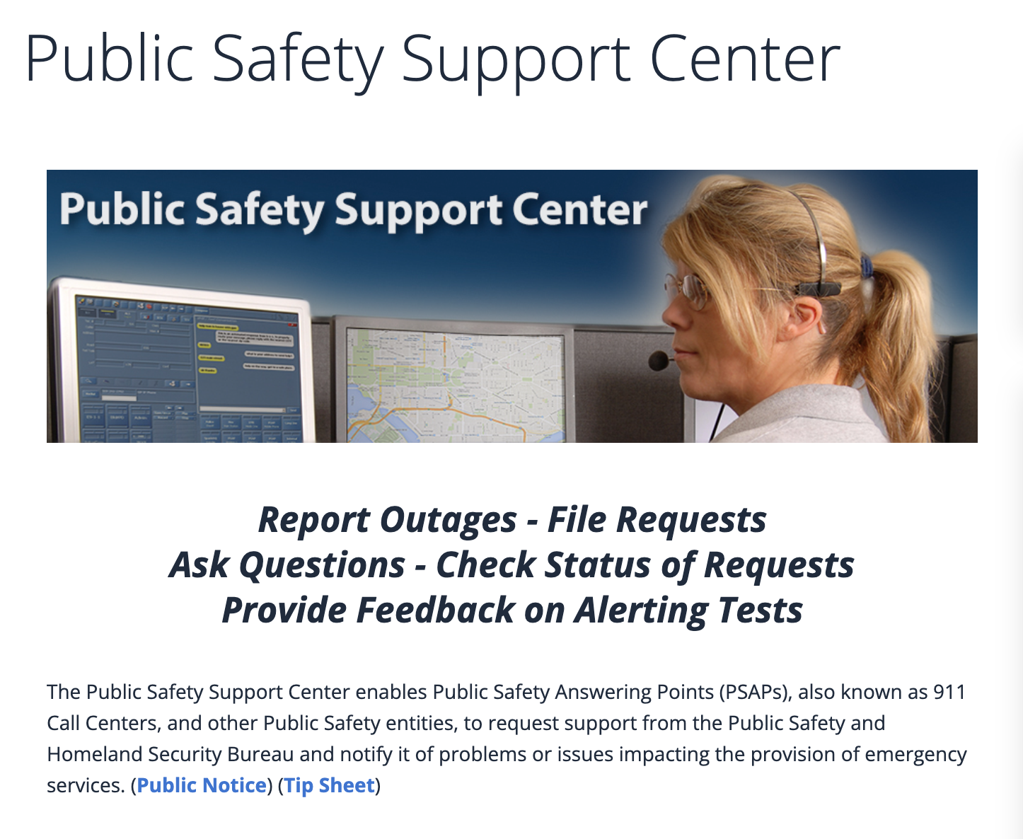
2. File A Public Safety Report
An average user might also need to file a public safety report. For the purposes of user testing, we specified filing a report about fraudulent 911 calls.
Assumptions: The user is a 911 operator who has been receiving regular fraudulent calls.
- Start at FCC Homepage
- Select "File a Public Safety Report"
- Select Report Category (Public Safety Reporting)
- Submit a Request
Analysis & Definition
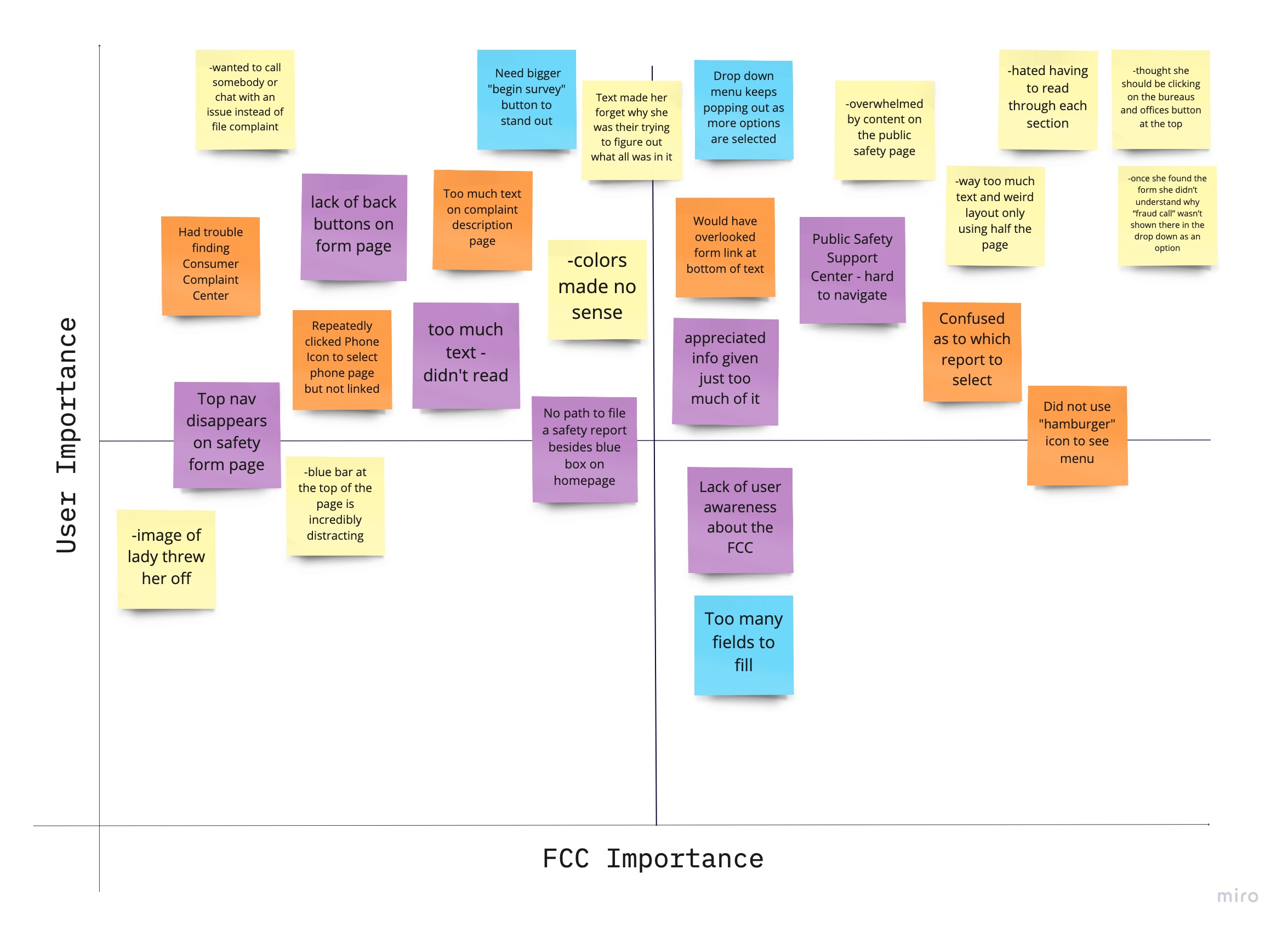
User Testing Analysis
We went through our user testing notes as a team, and created a matrix to establish what was important to fix for the user and what was important to fix for the FCC.
Overall, there was far too much text on most pages which caused the user to be overwhelmed and confused. There was a lot of good information being given by the FCC, but the shear volume was simply more than a user wanted to read.
The navigation and was likewise very cluttered with content making it difficult for the user to find what they were looking for. Furthermore, while we do enjoy some white space, several pages were not utilizing all of the available space to its fullest potential. Only half of the page was being used in some places.
These are just some of the many aesthetic and functional flaws pointed out during our user tests.
Card Sorting
This is where our team split off to work on our own individual solutions. We would continue to consult one another along the way for feedback, however.
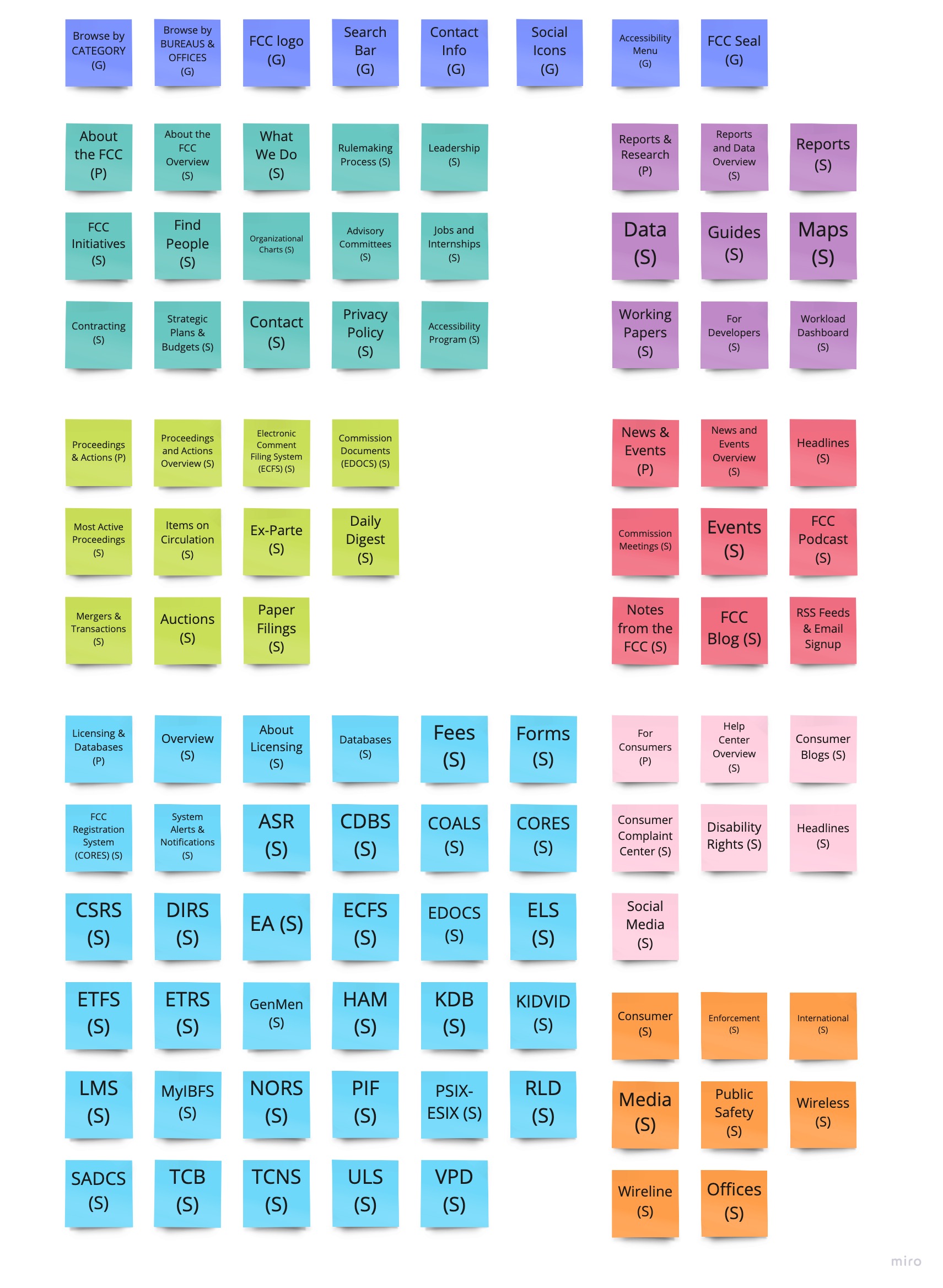
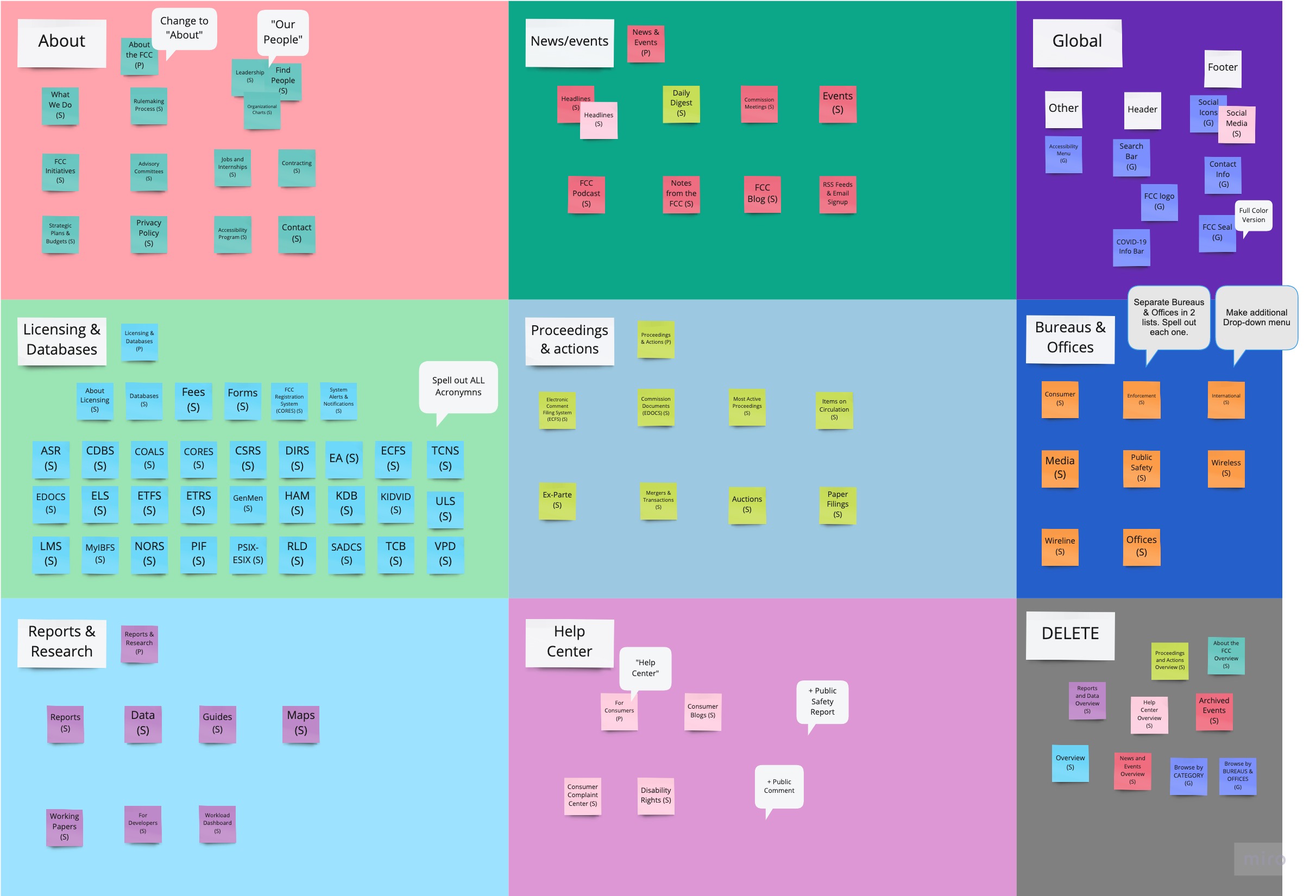
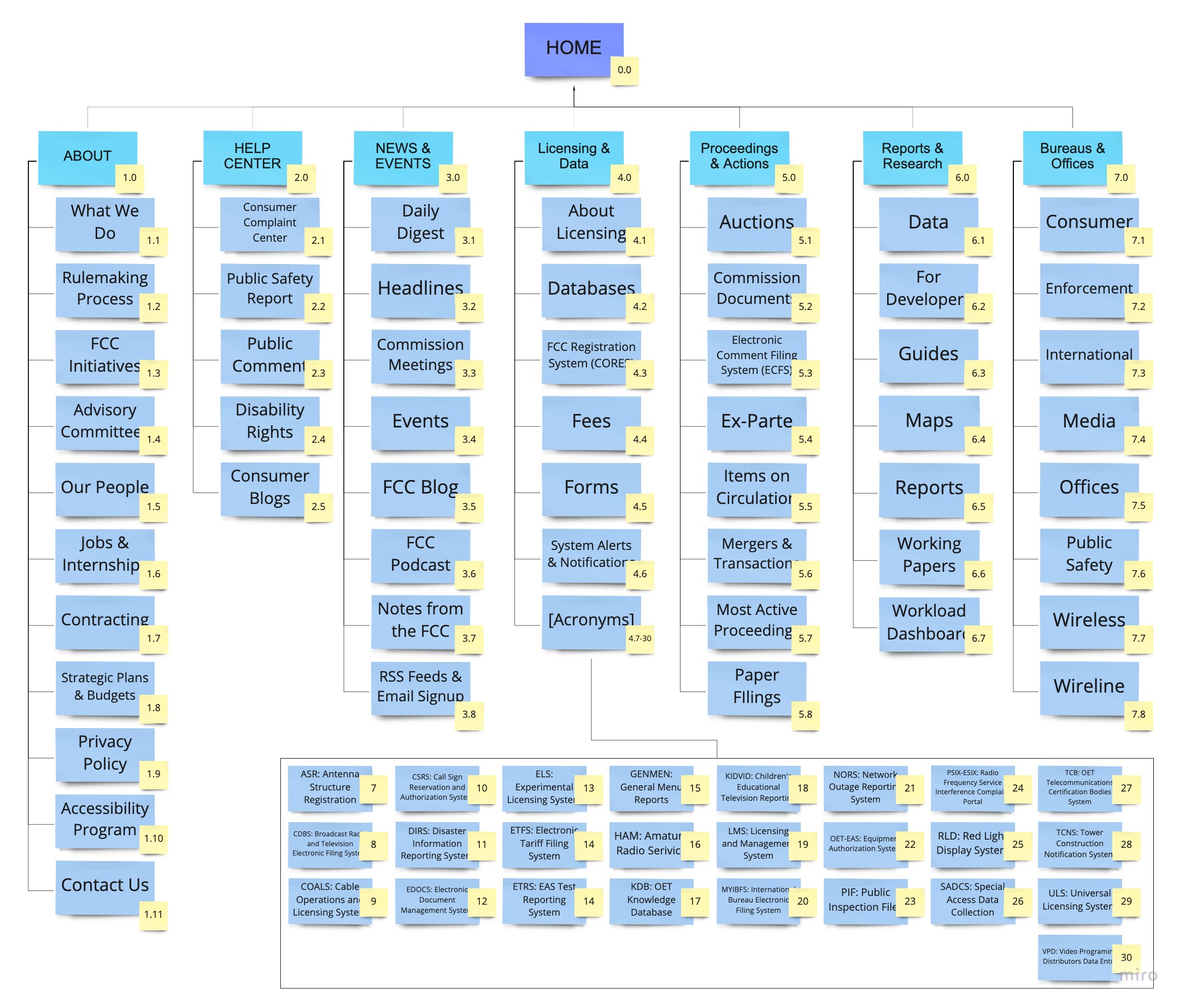
Site Map
I tried to keep most of the resources the FCC already had in the navigation, while streamlining and simplifying as best as I could.
The FCC website has countless subpages beyond what you see here. For the sake of time, I focused on only what you could see from the FCC homepage navigation.
User Interface Design
5 Second Tests
Using my clickable prototypes, I conducted quick 5-second tests on zoom with my two teammates.
Revision Notes:
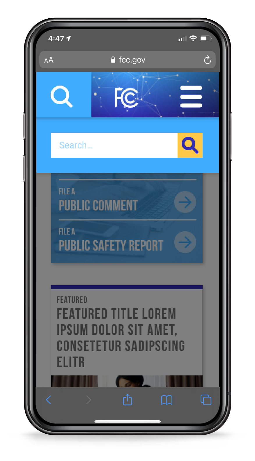
Web:
- Emphasize links
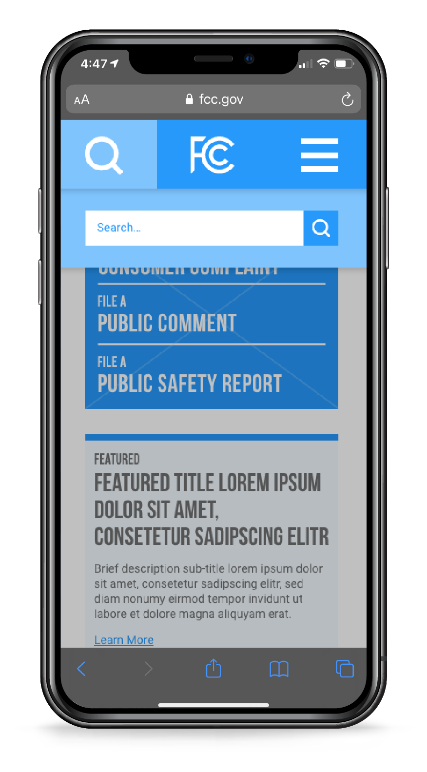
- Make search more prominent
Mobile:
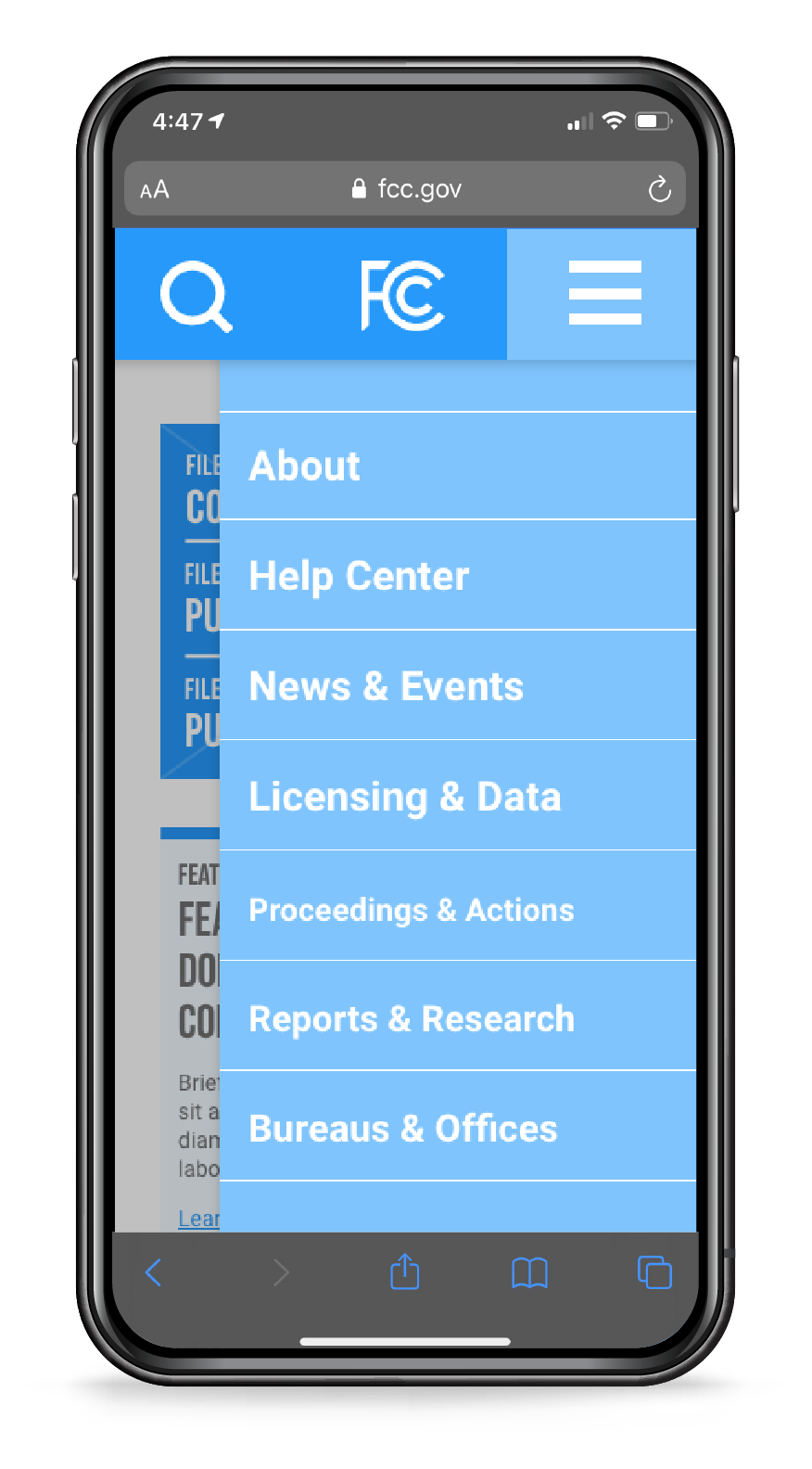
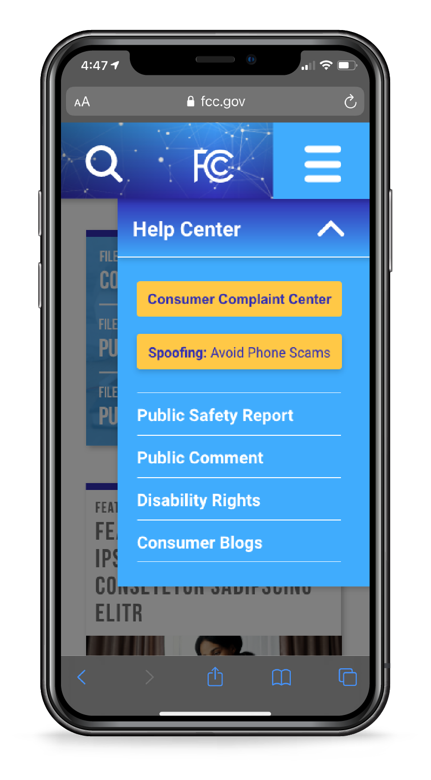
- Twitter: show only latest tweet
- Add chevron arrow to all menu items
- Flip existing chevron arrow 180
- Cut extra space on menu
- Streamline header to fit with iPhone status bar
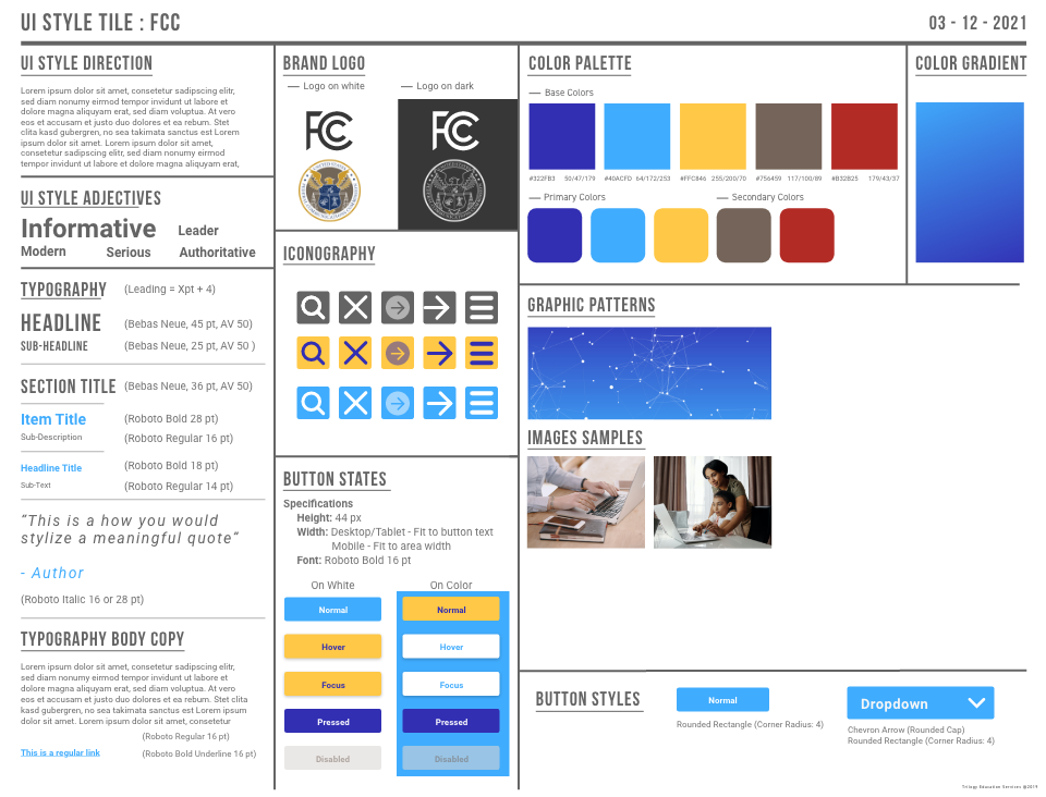
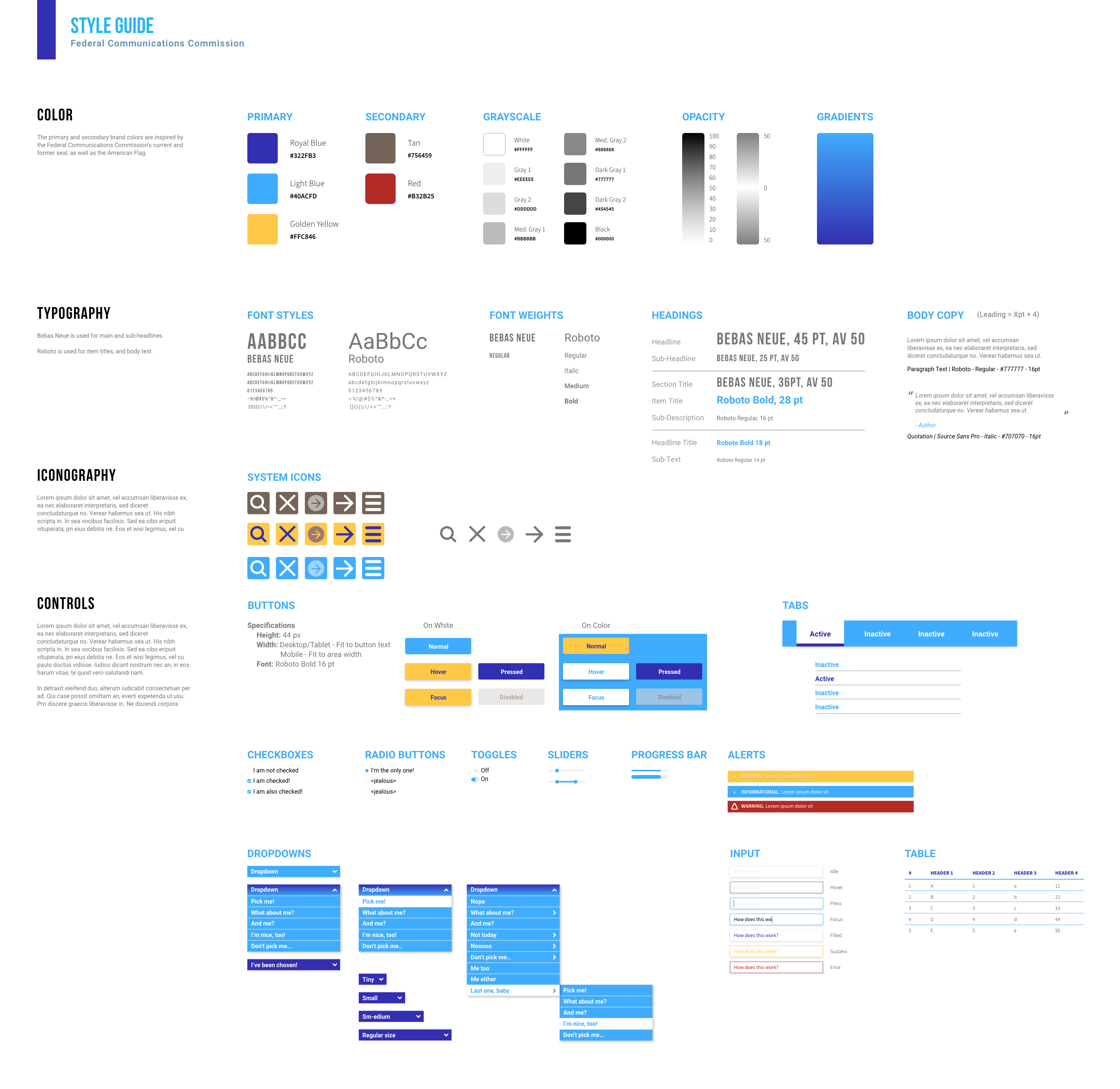
Style Guides
I created both a style tile and a slightly more detailed style guide for the revised FCC site. I did not want to stray too far from the colors of the existing brand, so I referenced the FCC seal and the existing colors used on the site. I also took some inspiration from the American flag in adding red for an accent color.
I wanted to keep an informative and authoritarian tone but more modern than their current style.
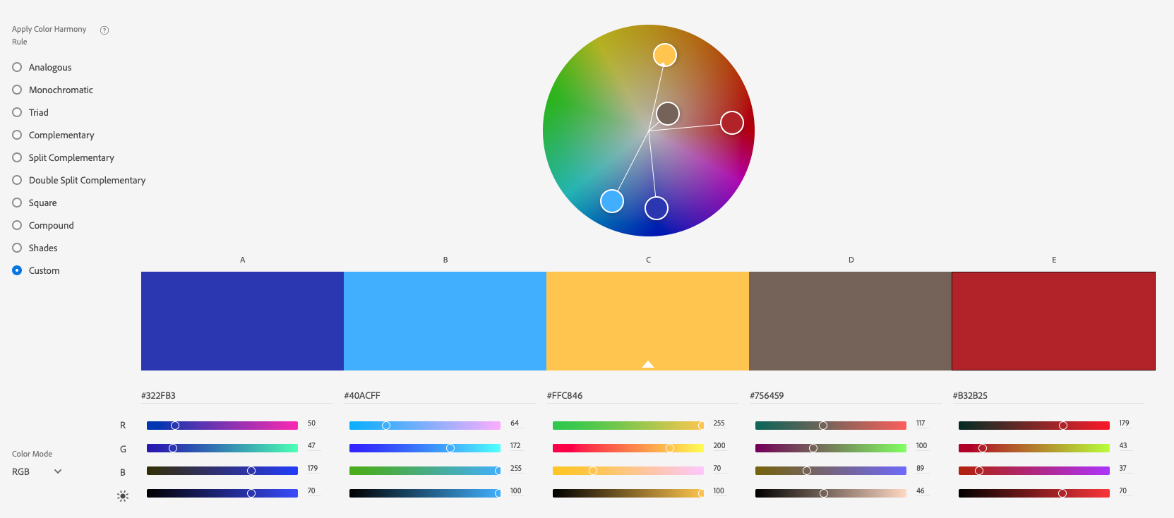
Style Tile
Style Guide
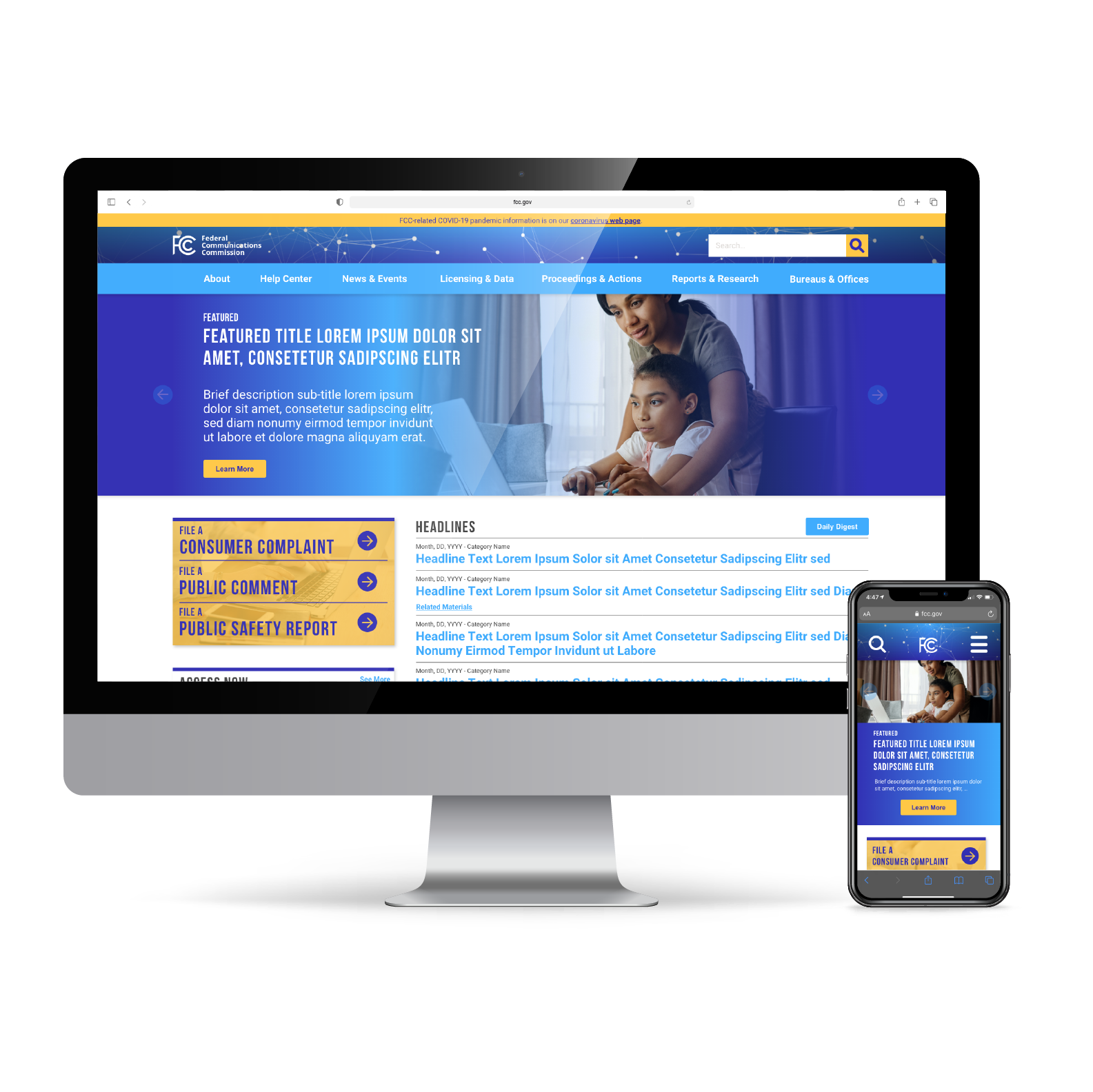
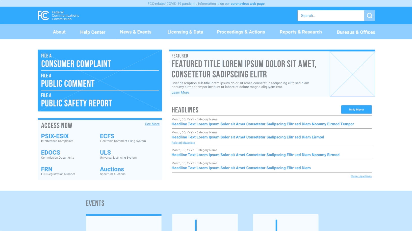
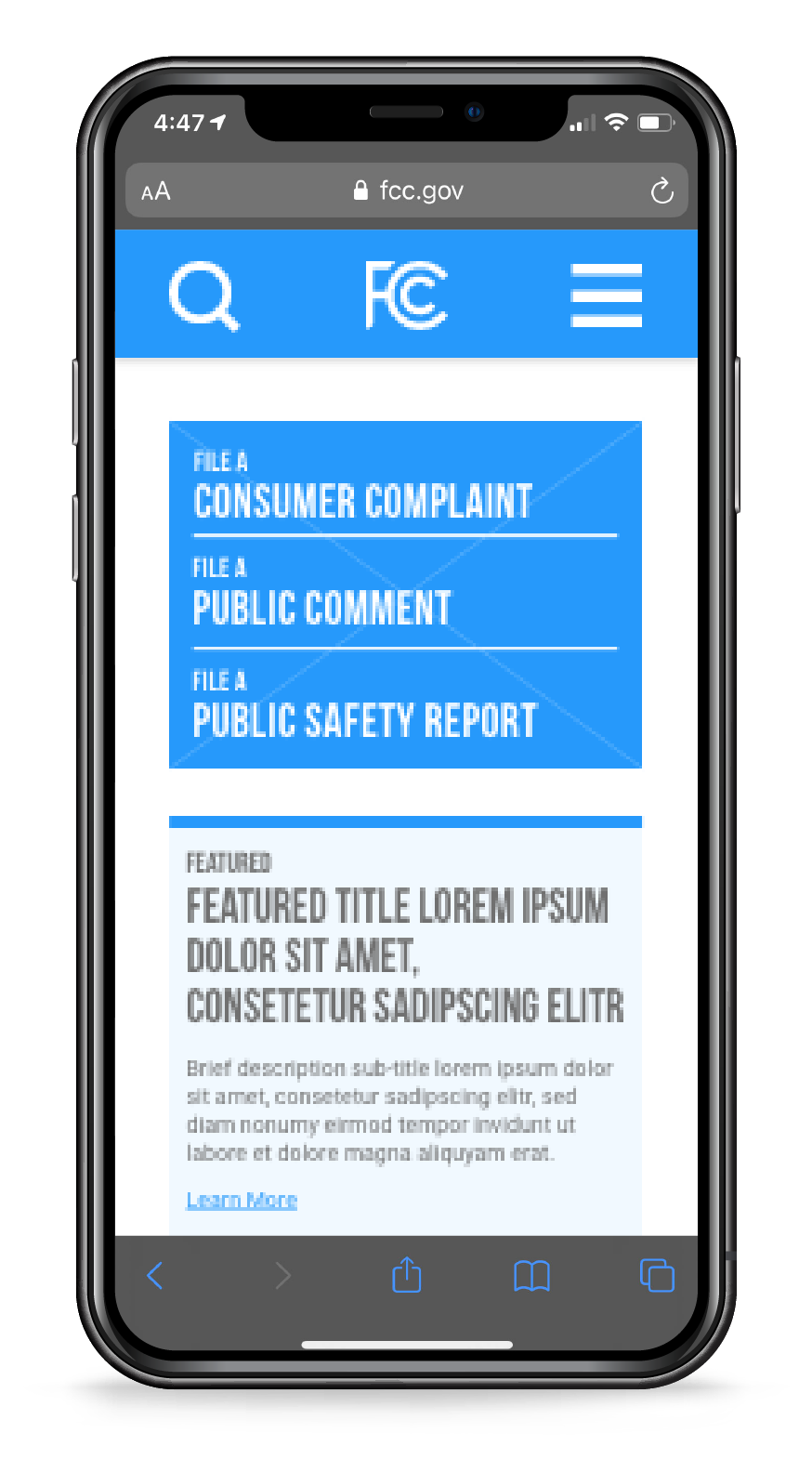
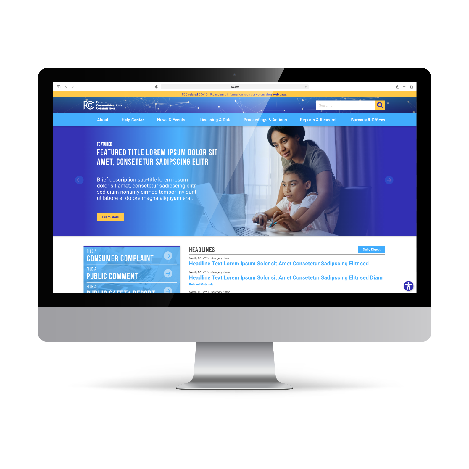
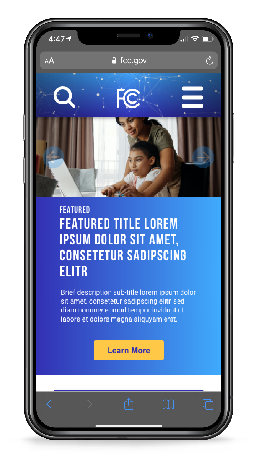
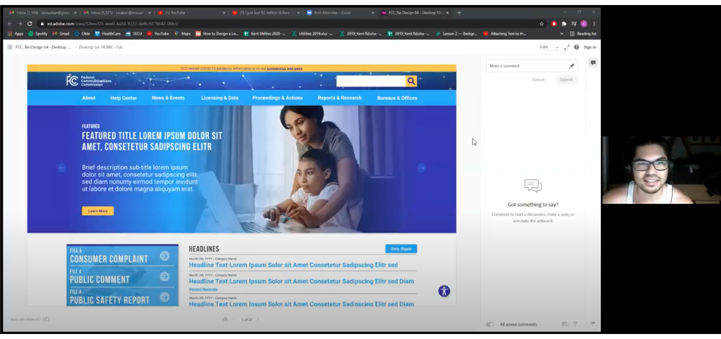
High Fidelity Prototypes
Using my newly created style guides, I created high fidelity prototypes of the FCC site. These are very close to what would become the final design, but another round of testing was conducted and a few key changes made before wrapping up my designs.
Clickable Adobe XD Prototypes:
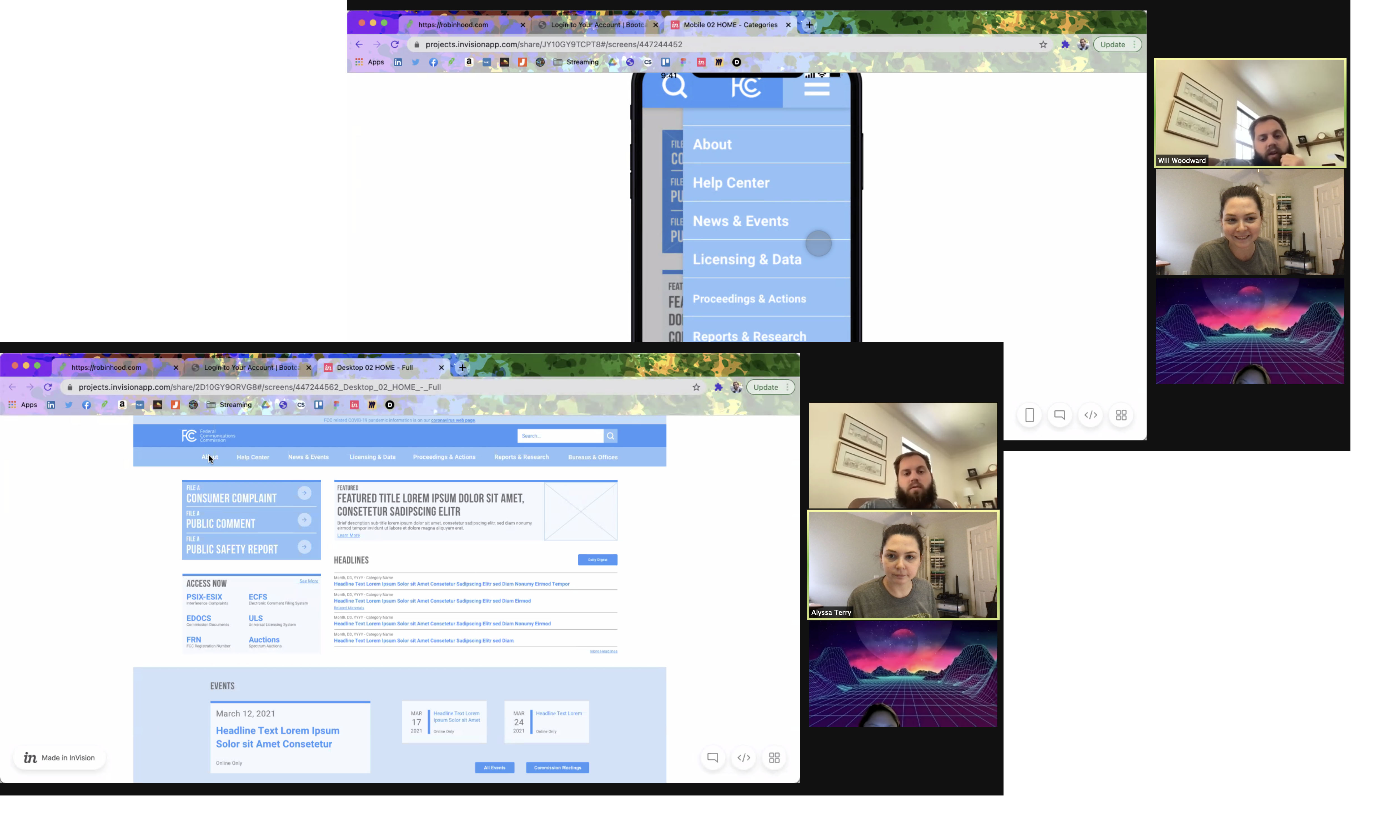
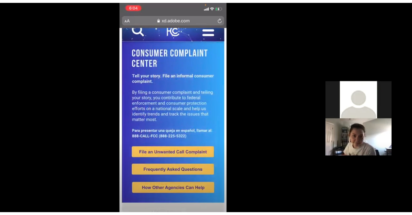
User Testing
Similar to my team's original user tests on the existing website, I conducted five additional usability tests on my high fidelity desktop and mobile prototypes.
1. File A Complaint
The average user is likely to use the FCC website to file a formal complaint about a telecom billing or service issue. For the purposes of user testing, we specified a complaint about robocallers.
Assumptions: The user knows that the FCC website is used for this purpose. The user does not actually need to submit a complaint.
- Start at Homepage
- Select "File a Consumer Complaint"
- Select Complaint Category (Phone)
- Fill & Submit Form
2. Explore the Prototype
The goal with this task was to receive general impressions and feedback on the prototype.
- Have participant explore the prototype they used for task 1 and give feedback
- If time and circumstances allow, have participant explore second prototype and give feedback
User Feedback
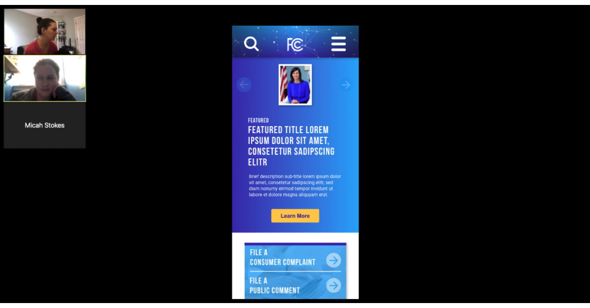
- Shrink size of carousel so that cards below are more visible before scrolling
- Explore possibility of making Consumer Complaint block yellow (if accessible) or dark blue to make it stand out better among the white and light blue
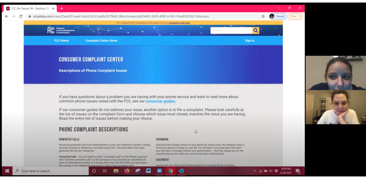
- Find a way to minimize the amount of text you have to scroll past on the phone complaint descriptions on mobile
- Give an option to explain certain terms while in form for those who didn’t read previous screen
- Fix white lines in header of consumer complaint center
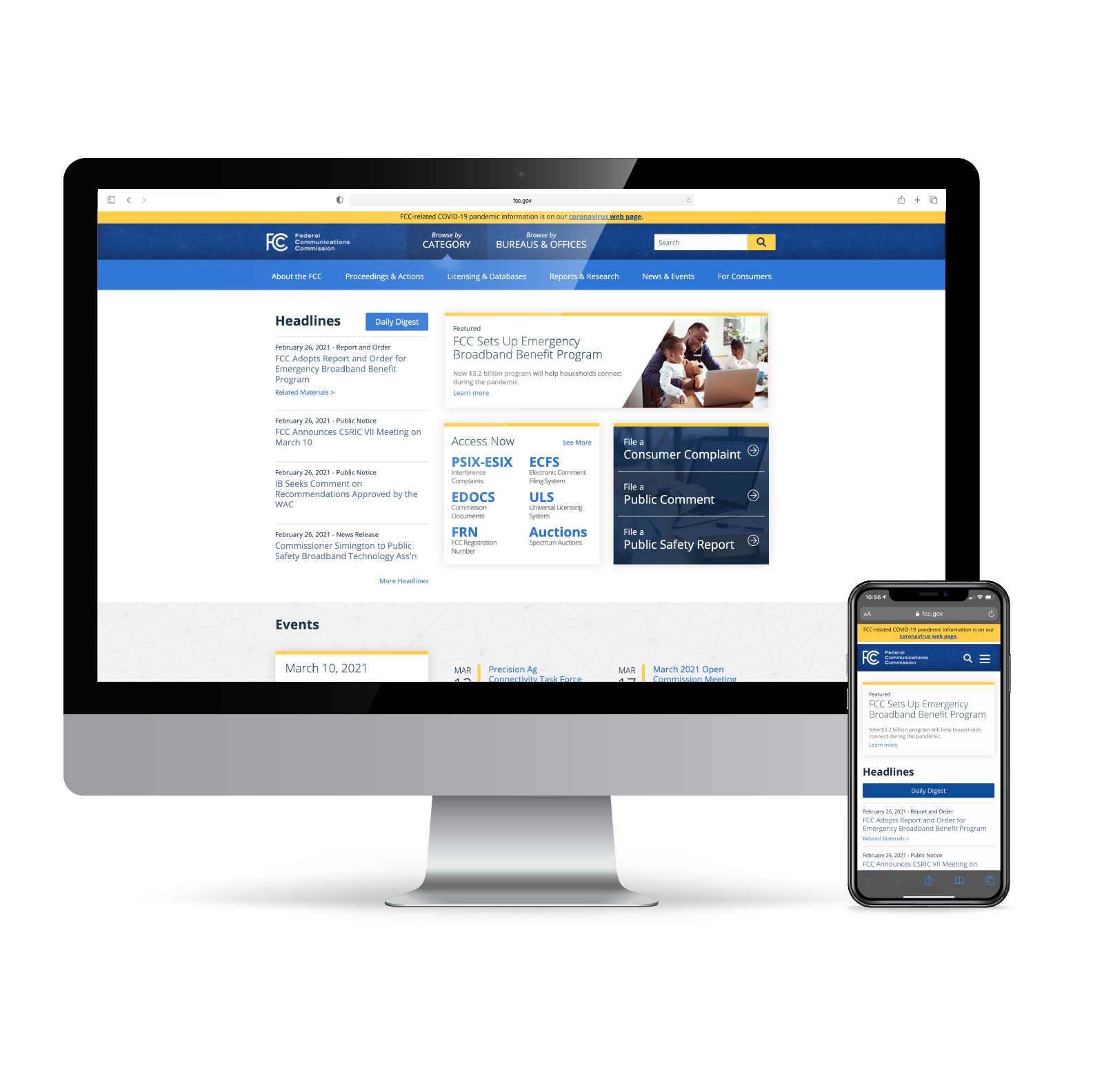
Final Prototype
Below are recorded click-throughs of the desktop and mobile final prototypes! Be sure to view at full screen to see all the details, or if you prefer to click through yourself please see the links at the bottom of this page.
Final Thoughts
A government website, like the Federal Communications Commission's, is so extraordinarily large and complex. It would take a large team of designers and developers years to fully re-design. I am proud of what I was able to accomplish in the five short weeks I worked on the site, but here are a handful of things I would have liked to continue developing:
- Create templates for main sub-pages in top navigation
- Re-design “Consumer Safety Center”
- Fix prototype glitches in homepage header carousel (mobile & desktop)
- Fix prototype glitch in homepage leadership carousel (mobile)
- Expand form on mobile prototype
- Add clickable (i) icon to explain uncommon terms in form in addition to previous screen explanations